
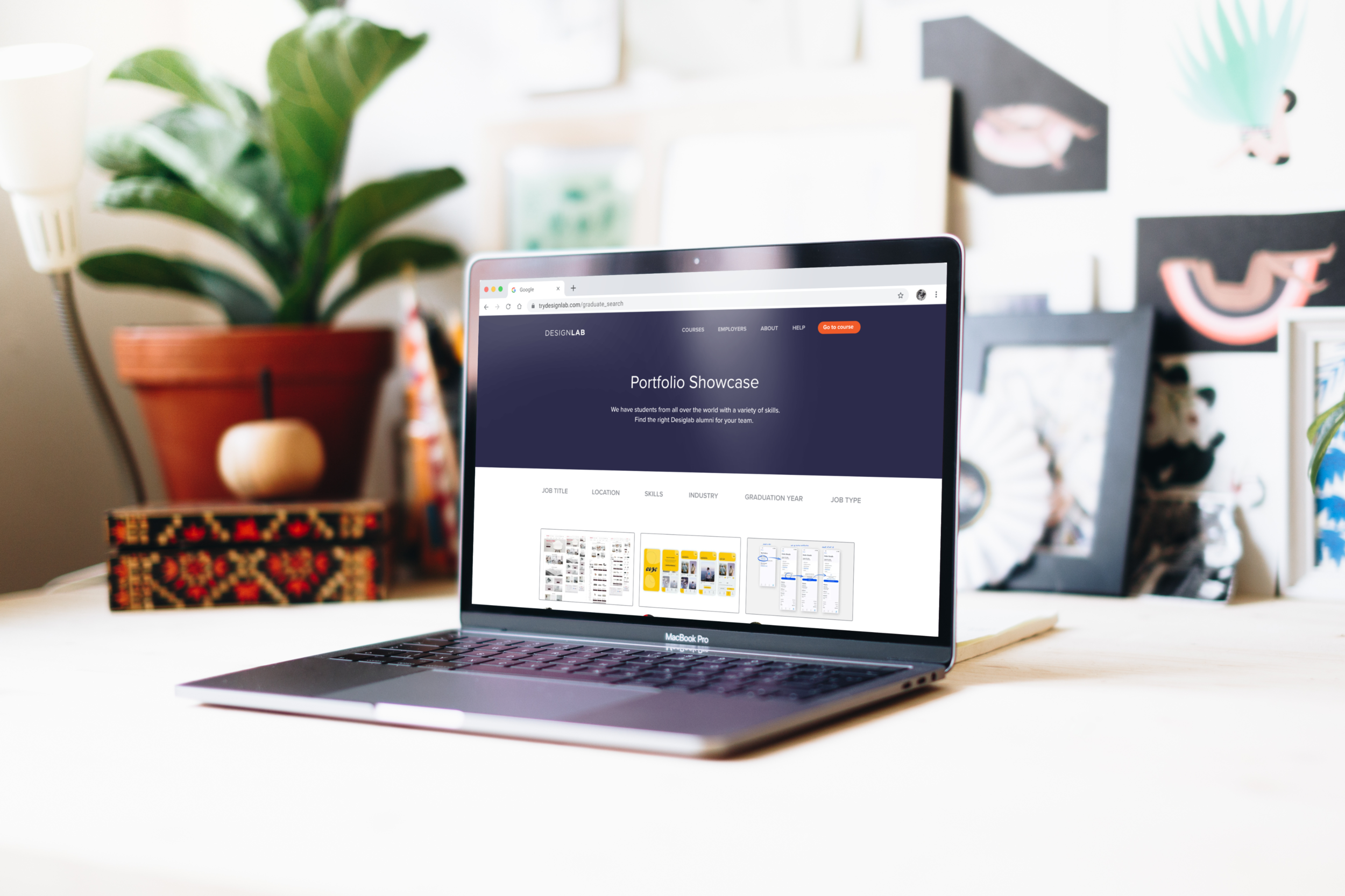
DESIGNLAB | Alumni Portfolio Showcase
My Role
UX Researcher
UX Designer
Project
Responsive Web Design
Skills Applied
Tools Used
Figma, Whimsical, Mural
The Project
Designlab trains people to become product designers through their online bootcamp. Great curriculum, 1:1 mentorship—but their alumni were struggling to connect with hiring managers looking for new design talent.
The Challenge
Designlab graduates were finishing the program without a clear path to get in front of employers. Meanwhile, hiring managers and recruiters had no way to discover this pool of trained designers.
I partnered with Designlab's Career Services & Partnerships Lead to solve both problems: How do we connect qualified alumni with companies actively hiring?
Drawing on my recruiting background, I knew hiring managers would value direct access to browse and search Designlab graduates—but only if we built it right.
My Approach and Process
Conducting the research
I needed to validate whether a portfolio showcase would actually solve the problem for both sides—alumni looking for work and employers looking to hire.
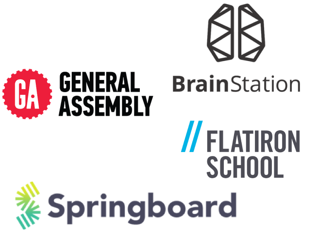
I looked at competing bootcamps (General Assembly, CareerFoundry, Springboard) to see how they connected graduates with employers.
The findings were surprising: none of them offered a searchable alumni showcase. Most had a generic "hire our grads" link buried in navigation. Only one actually explained what employers would get by signing up.
This was a clear opportunity—Designlab could differentiate by building something competitors weren't offering.
What I learned from alumni
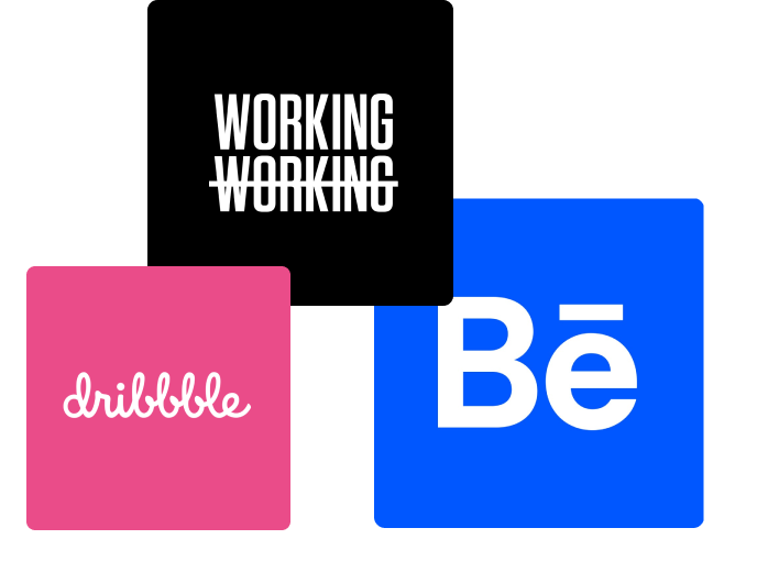
I researched portfolio platforms like Dribbble, Behance, and Working Not Working. Most charge employers to access talent but offer limited search functionality. Only two platforms let designers share contact info directly—a major friction point for hiring managers who want the ability to quickly reach out to talent.
What I learned from employers
User interviews revealed three distinct groups, each with different needs and constraints:
Defining my users
Creative Recruiter (agency-side)
Fast-paced, always hunting for the perfect match across multiple clients. They need quick filtering and easy portfolio access.
In-house Recruiter (company-side)
More patient, collaborative process with hiring managers. They prioritize culture fit and want to dig deeper into each candidate.
How did these personas impact the project?
The client originally wanted both a portfolio showcase and a job board. User research made it clear the job board was unnecessary—hiring managers wouldn't use it, and alumni were lukewarm at best. I cut the feature and focused on what would actually move the needle: searchable, accessible alumni profiles.
Rethinking the navigation
Designlab's navigation was already packed. Adding a portfolio showcase meant restructuring the entire nav bar—consolidating existing items into dropdowns and finding the right home for this new feature.
I used insights from competitor research (what worked on other bootcamp sites, what confused users) combined with interview findings to design a navigation structure that made the showcase easy to discover for both employers and alumni.
Designlab Alumni (job seeker)
Nervous, eager, and making a career transition. They need visibility and an easy way to showcase their work.
Synthesizing my findings


Building the prototype
I focused on two critical user flows:
Employers searching for alumni to hire
Employers exploring partnership opportunities with current students
I built the prototype using Designlab's existing design patterns—reusing components from their mentor profile pages and navigation structure. This wasn't just for visual consistency; it meant less engineering work when handing off designs to the dev team.
Testing started on Designlab's homepage to validate that the new navigation worked—could users find the showcase in the dropdown menu without getting lost?

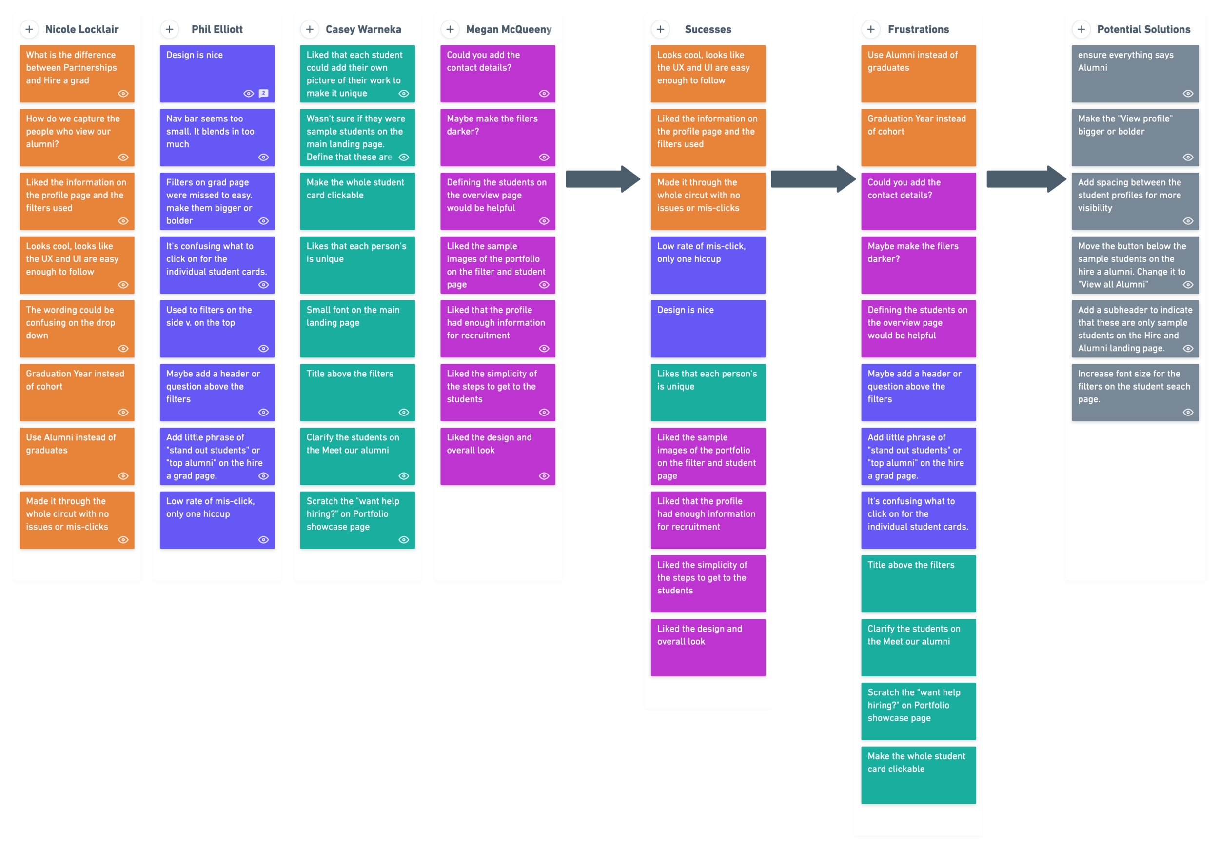
Key findings:
✻ Users wanted more breathing room between elements
✻ Some language was confusing (particularly internal terminology)
✻ The word "Grad" didn't resonate—"Alumni" tested better and felt more professional
From initial sketches and ideation….
Based on these findings
I iterated on spacing, clarified confusing copy, and worked with the client to standardize on "Alumni" throughout the experience. These changes improved clarity and performance in follow-up testing.
I tested the two primary flows with 4 participants. Overall, the experience was successful—users navigated the flows easily and gave positive feedback.
Testing & Iteration


to final mockups, I kept the users top of mind.
The outcome
The final designs balanced the needs of two very different user groups: alumni making a career transition, and employers searching for new design talent. The showcase makes it easy for both sides to connect—clean, searchable, and built on Designlab's existing patterns for smooth implementation.
Reflections
This project sat at the intersection of everything I care about: design, recruiting, and helping people find work they love.
My recruiting background was both an asset and a challenge. I had strong assumptions about what hiring managers would want, but user research kept me honest. Listening to actual users—rather than relying on my own experience—led to better decisions, like cutting the job board and focusing solely on the showcase.
It was a good reminder that even when you think you know the answer, the users may surprise you.