
CABIN | An App for Quilters
My Role
UX Researcher
UX/ UI Designer
Brand Development
Project
Mobile App design
Skills Applied
Tools Used
Figma, Figjam, Airtable, Mural, Maze
The Project
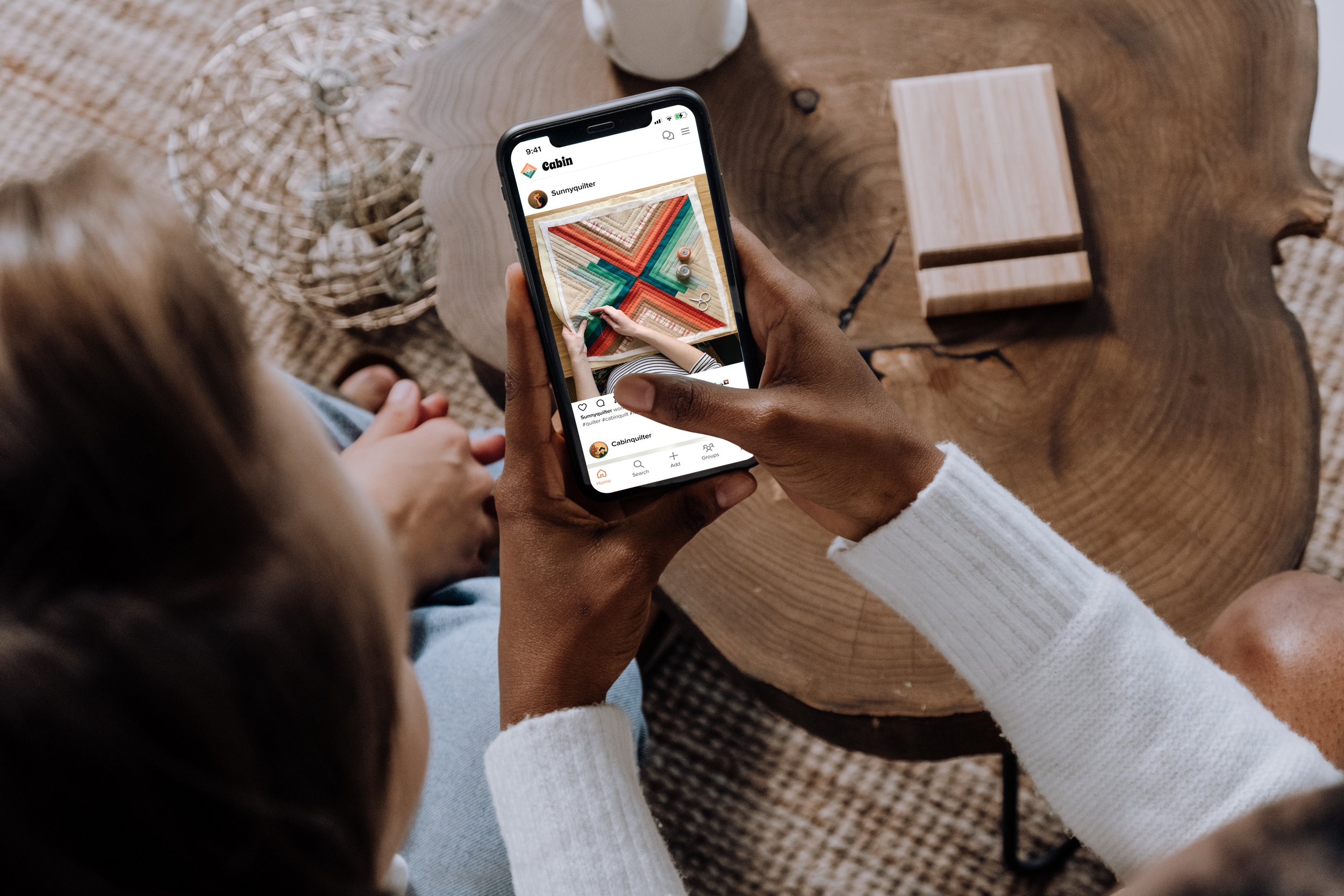
Cabin is a mobile app designed for a new generation of quilters—millennials and Gen Z crafters looking for a modern space to connect, share their work, and find inspiration.
The Challenge
The quilting world is evolving. Younger quilters are bringing modern aesthetics to traditional techniques, but the existing digital landscape hasn't caught up. Most quilting apps feel dated, hobbyist, and low-tech—not designed for a generation that expects seamless, social-first experiences.
The opportunity: Create an app that feels as modern as the quilters using it—a place to share work, connect with others, get inspired, and learn.
As a brand-new concept, I needed to define the entire product from scratch: key features, branding, UI, and user experience.
My Approach and Process
Conducting the research
I needed to understand what features quilters actually wanted—not what I assumed they'd need.
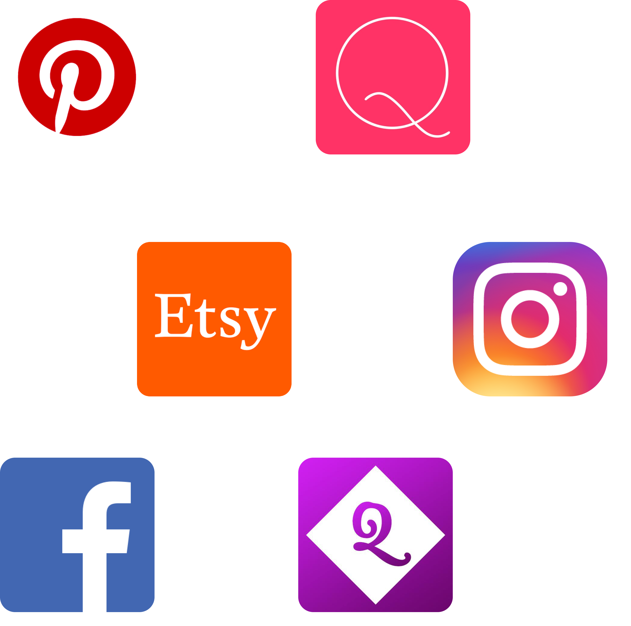
What's already out there
I found one app with a similar concept called Quiltspace. It had simple features but felt unmaintained and hobbyist—unclear navigation, unused features, and outdated branding. There was clear room for improvement.
Most quilting apps focused on utilities: fabric calculators, project planners, tutorials, and shops. None were designed to connect quilters or showcase their work.
This led me to explore where quilters were actually connecting: Pinterest, Instagram, and Facebook groups. Multiple quilters pointed me to Ravelry (a knitting community site) as the gold standard—proof that crafters wanted a dedicated space built for their community, not a workaround on existing social platforms
Defining the user
What they had in common: Both groups wanted to connect with people who understood the work that goes into quilting—from selecting patterns and fabric to cutting, sewing, and binding. They wanted to share their creations with people who could truly appreciate them.
I connected with millennial and Gen Z quilters through online quilting groups—a warm, welcoming community eager to share their experiences.
Two distinct user groups emerged

The key insight: Everything came back to connection. Quilters wanted to share their work with people who understood the craft.
I grouped features into Priority 1 (connection-focused, immediate needs) and Priority 2 (nice-to-haves that could come later). This helped me design screens that put the most important features front and center while keeping the product focused and achievable.
I created an initial feature list based on market research, then validated it through user interviews. Some features sounded nice but users admitted they'd never actually use them. Others were non-negotiable.

Prioritizing Features
Advanced Quilters (Michelle Ford)
These quilters work professionally or have been crafting for decades. They wanted connections with other passionate quilters and collaborators who could support their business—like long-arm quilters or pattern makers.
Intermediate Quilters (Lauren Williams)
Hobbyists looking for tips, advice, and inspiration for their projects. They wanted to learn from others and share their progress.
Mapping the Experience
Sitemap
Using the prioritized feature list, I created a sitemap to guide screen design and user flows.
Since Cabin was starting from scratch, I looked at how apps like Facebook and Instagram launched—simple, focused, and familiar. I had to resist the urge to include every possible feature. The goal was to create something delightful and easy to use, not overwhelming.
This was harder than it sounds. I had tons of ideas for how Cabin could grow, but I kept reminding myself to launch with what matters most.
User Flows

I focused on the two core reasons someone would download Cabin: to connect and to share work.
I mapped out the happy paths for:
Posting a photo to their feed
Joining a group
These flows became the foundation for all the screens that followed

Creating the Brand

The name Cabin comes from the log cabin quilt block—a classic pattern featuring fabric strips that resemble an A-frame cabin with a warm hearth at the center.
Cabins evoke coziness: woodsy retreats, fireplaces, good books, warm drinks. Quilts carry the same feeling. I wanted the brand to capture that warmth while feeling modern and inviting.
Visual Identity
Brand attributes: Inspiration, Connection, Discovery, and Curiosit
The logo uses the actual log cabin quilt block pattern—instantly recognizable to quilters, unique, and meaningful.
For the color palette, I chose green (woodsy, natural) and orange (cozy fire, sunset). Most quilting apps lean heavily on pink and blue, so this felt fresh and aligned better with Cabin's vibe.


I designed the curious fox as Cabin's mascot. Foxes embody curiosity (one of Cabin's guiding principles), have a natural geometric look that fits quilt aesthetics, and appear in many quilt block patterns. Plus, the fox felt right at home with the woodsy cabin vibe.
I could see this expanding into a whole woodland creature family depending on future messaging needs.
Building the Prototype
From sketches to mid-fidelity
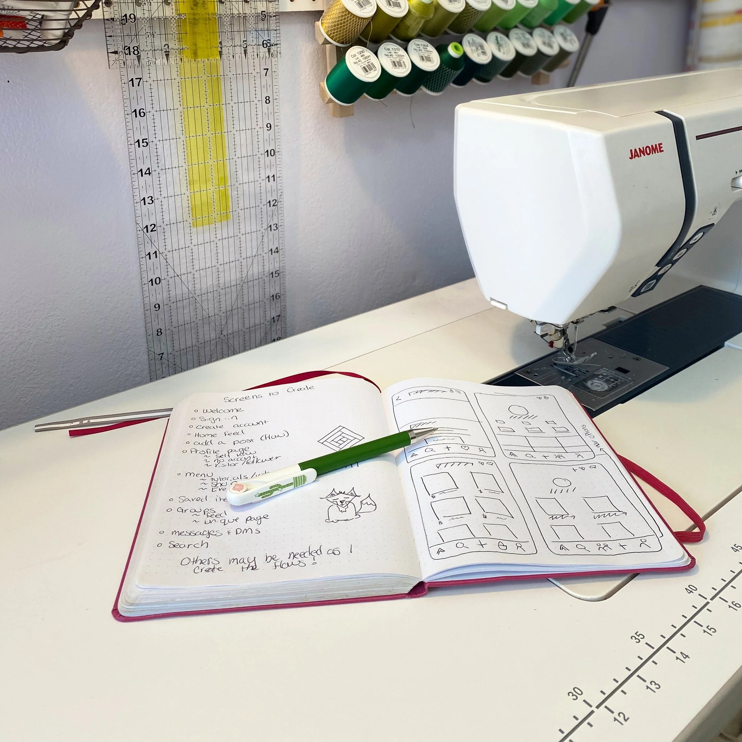
I started with sketches and a list of screens I thought I'd need. These evolved into mid-fidelity screens that helped me clarify user flows and test different ways to display features.
I walked a few users through the mid-fidelity concepts—even without formal testing, their feedback was invaluable. One user reminded me to give priority features "pride of place," which shaped how I approached the final designs.
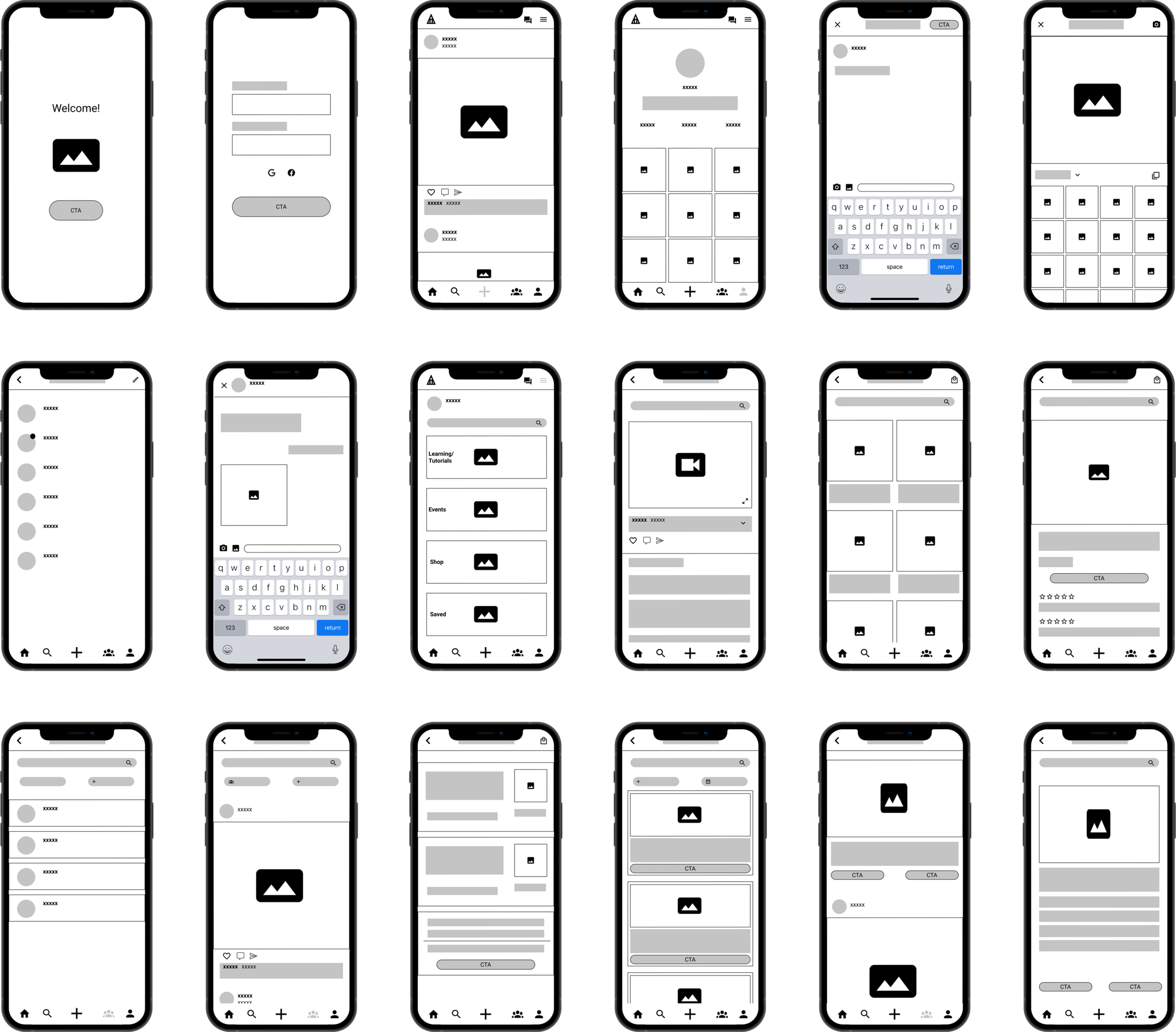
With the mid-fidelity foundation in place, designing the high-fidelity screens felt seamless. I gathered image assets in advance to create a unified visual language across the product.
High-fidelity screens

What made the cut
I designed screens for a fully functioning app, but for testing, I focused on the core flows. Some screens—like the option to skip profile creation—stayed in the background for this round. I wanted users to have that choice, but it wasn't critical to test yet.
What I learned about testing methods:
Key findings & changes
The main issue wasn't navigation—users found Cabin familiar and intuitive, like "apps they already know and love." The problem was onboarding. Users needed guidance when they first entered the app.
I tested Cabin using both 1:1 sessions and Maze (for unmoderated testing). This combination let me gather more feedback within a tight timeline.
Testing & Iteration
Live testing gave me the chance to remind users that this was a limited prototype and keep them focused on the task. Maze testing revealed something interesting: users explored beyond the task, clicking on things they wanted to see even when it wasn't part of the flow.
One user said: "While shopping, I would love to be able to read reviews or see photos from previous buyers about their experiences. However, the checkout process was easy and straightforward."
They weren't supposed to check reviews—but they wanted to. This showed me what users would naturally explore in a fully functioning app, which was actually a useful insight.
Welcome screens introducing key features
Interactive tooltips pointing out:
Top navigation bar
Bottom app bar (with quick access to Groups, the second-highest Priority 1 feature)
Hamburger menu for Priority 2 features (Events, Tutorials, Shop)
This gave users a clear mental model of where to find things without overwhelming the interface.


What I updated
Reflections
This was the first app I built entirely from scratch—name, brand, features, everything. It gave me new appreciation for companies that create instantly recognizable brands. Names like Google or Amazon seem random when you think about it, but they become so embedded that no one questions them.
Cabin taught me to stay disciplined. I had so many ideas for where this app could go, but user research kept me grounded. The final product balanced what I thought was cool with what users actually needed—and that tension made it better.
The result is an app that feels modern, familiar, and built for the community it serves. Not just an app I wanted for myself, but one that solves real problems for real quilters.